Zwift Typeface + Brand Refresh
The Zwift Brand Team collaborated with award-winning UK based type foundry Colophon to design a custom typeface and wordmark for the Zwift brand.
Foundry: Colophon
Creative Director: Lloyd Murphy
Brand: Laurent Janneau Houllier
Producer: Kimiya Enshaian
2021

To complement Zwift designing its first line of connected products, the Zwift Brand Team initiated work on a custom typeface and wordmark. Bold new industrial designs presented a chance to reinforce the visual identity with a stronger design system that could service all Zwift platforms.


The Zwift brand facilitates work ranging from industrial design, to UI design, to advertising. This was an opportunity to rally all Zwift teams around one unified creative vision – capture the innovative optimism of the digital fitness space while maintaining elements of cycling heritage and industry credibility.


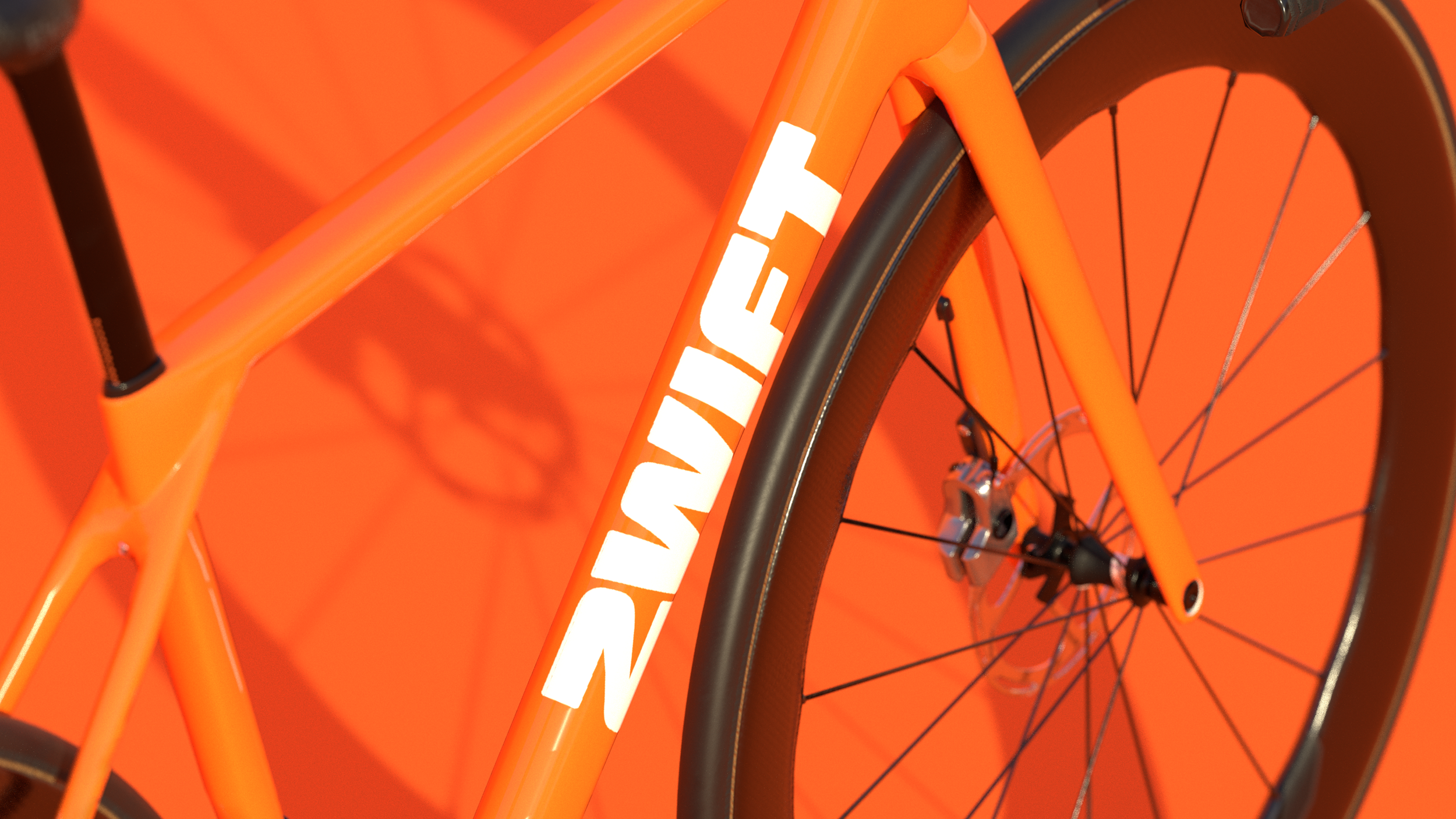
Design started with Zwift Sprint – the primary, display family of the typeface – an expression of the core Zwift brand principle of fun meets performance. Striking as a wordmark and headline font while functional for almost all design uses, movement is created with gestural weights and contrast between sharp and winding angles.
Large radius curves and sharp interior edges trace a subtle lineage back to the Big Z icon. Lowercase characters continue this motif contrasting long, sweeping curves with strong horizontal ascenders and descenders.
Take it for a spin
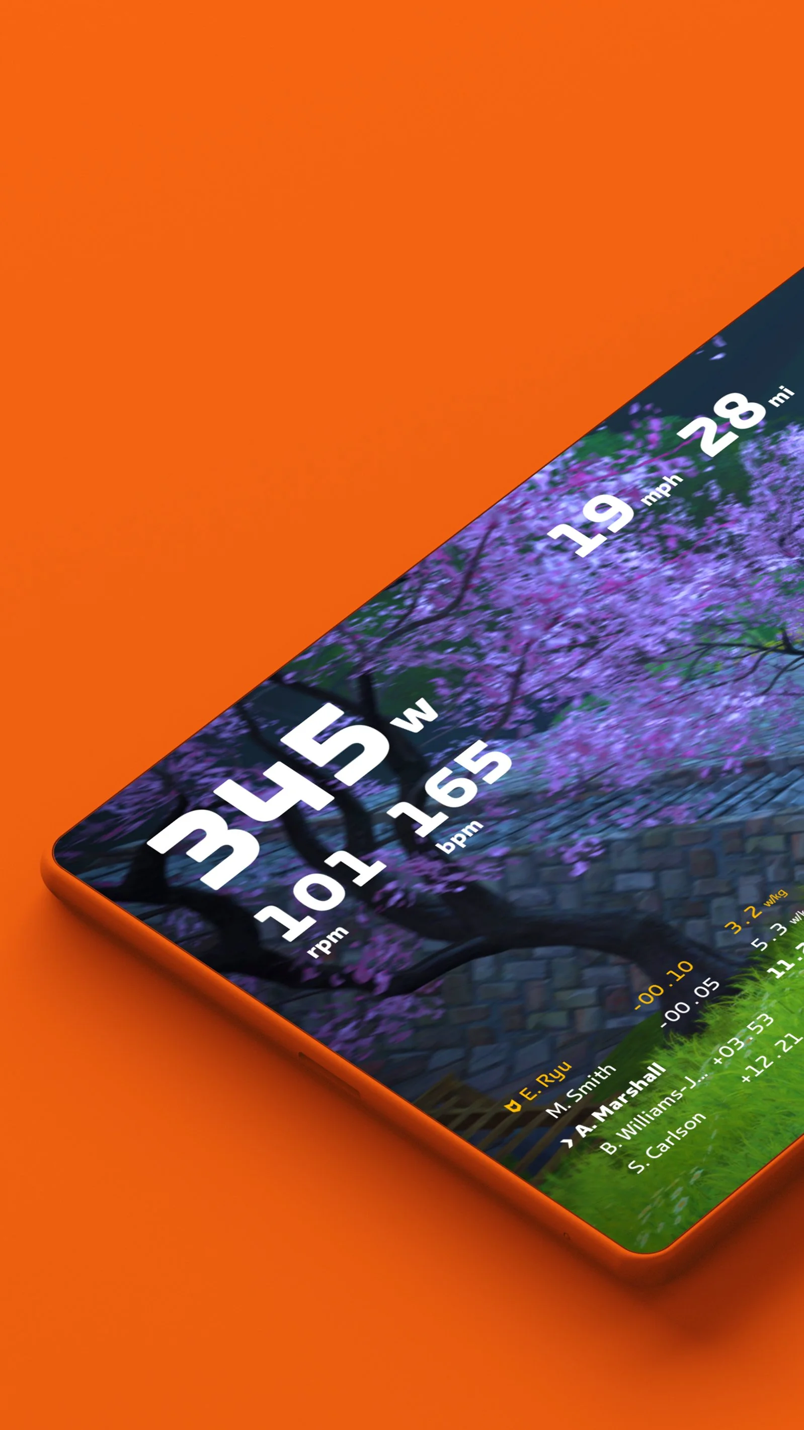
At all stages of design, one versatile family of typefaces was a central pillar of the design brief. While important as a functional, readable design tool – a flexible and recognizable typeface connects a diverse range of experiences to each other and to the trusted Zwift name.


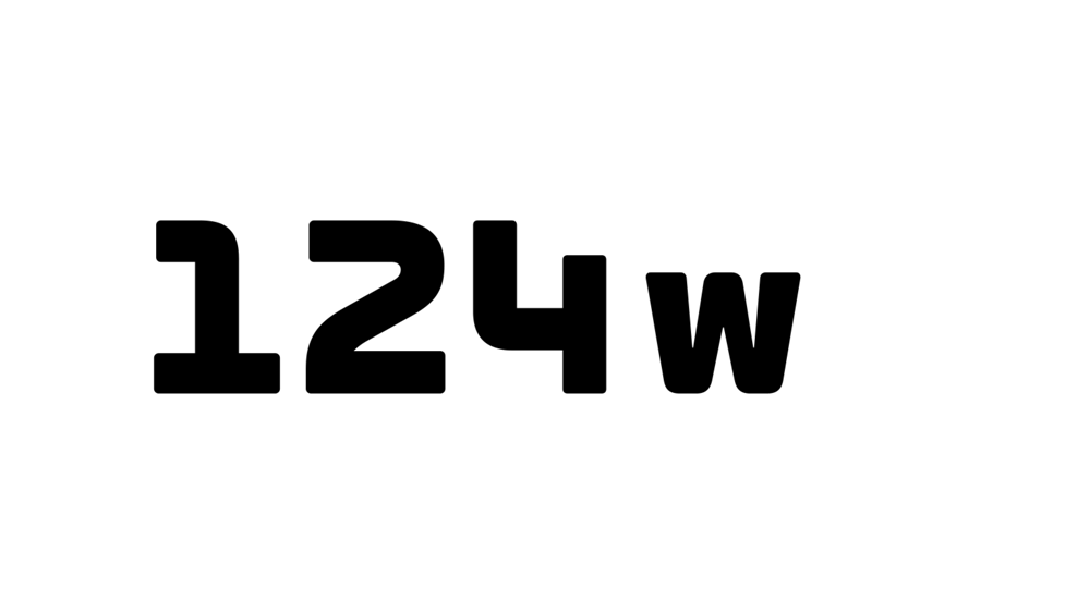
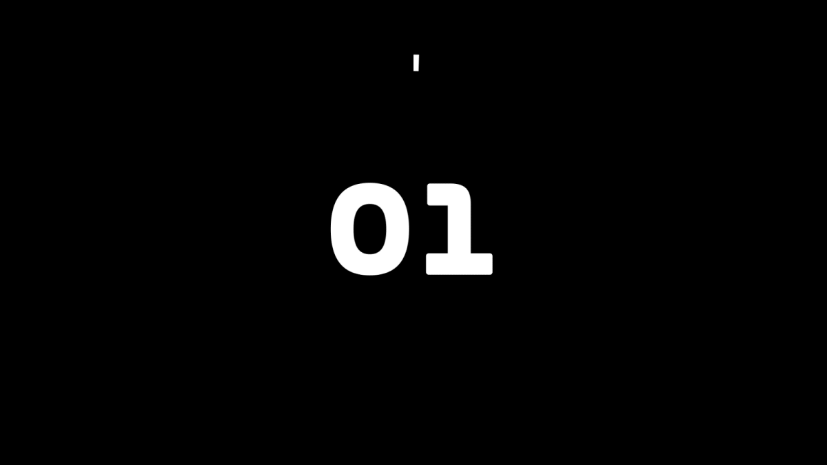
Zwift Chrono is the Zwift monospaced family. Numeric data is a crucial element of the Zwift platform and is always on the move. This data-centric variant amplifies readability at small sizes while providing elements of expression high-speed reading.
Road to Sky
17.3km
1045m
La Reine
22.8km
1181m
The Pretzel
72.2km
1333m
Ven-Top
20.9km
1534m


Zwift Fondo is an alternate family designed to ensure versatility for the Zwift typeface for many future years. Fondo significantly changes the expression of the Zwift typeface while maintaining the same proportions as Sprint.


Accessibility considerations are a key part of all Zwift design implementation. Extensive UI/UX user testing presented the opportunity to proactively accommodate future use-cases for visually impaired users and beyond. Carefully selected alternate characters soften curves and subtly improve readability for long running text while retaining brand equity at all sizes.